Pages

Tuesday 29 November 2011

Week 8 Directed Study

        Detail in Man - made Forms: Vehicles.
          These are three sketches made with 2 different mediums (pencil and markers). 1a is the most succeessful in terms of perspective and proportions, it was drawn with pencil and the vantage point chosen gives it a more dynamic look.
          The way I approached this drawing, because of its technicality, was to break down the car into smaller parts that represented basic geometric shapes, that helped recreate those ellipses around the tyres and the spoiler. After the basic shape was completed the next step was see how light bounced off the vehicle's surface, as different parts of the car have different texture materials on them, light must be proceeded in terms of its shade values and highlights.  
1a

         Drawing with pencil allows me to cover /erase my mistakes easily, though drawing vehicles with markers has proven to be quite a challenge, one has to be very careful not to make any mistakes beforehand as markers are a not very forgiving medium. This is one of the reasons 2b and 3c are not in my opinion successful, though they are very easy to use when shading, they are easier to capture those shiny surfaces that show how light interacts with form.

2b


3c

Sunday 27 November 2011

Week 7 Directed Study


Refraction & Distortion
For this week’s directed study I chose a simple glass, drawn in different mediums  (charcoal, pastels and graphic markers).  Each drawing is from a different angle so that you get a variation on the reflections and highlights on the glass.
Drawing (A) was done in charcoal, white pastels were used for highlights and as you can see the upper half of the glass shows through and has the same tonal variation as the wall. White areas indicate reflected areas, and on the bottom half you can see the distorted image created by the glass. Drawing A (charcoal) was the most effective, mainly because I was more familiar with the medium and it was easier for me to capture the highlights and have a high contrast with the shading values for the reflections.
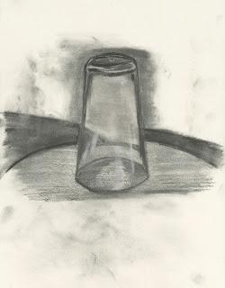
(A) 

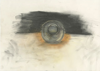
Drawing (B) was done using graphic markers, I feel that I have much more to learn on how to use them as I find them hard to manipulate. Mistakes are hard to cover, and I have issues with blending same tonal variations, as you can distinguish all the lines drawn from the same marker and the mistakes from using the wrong marker to do the reflection on the surface. What I like though is the contrast in this image. 
(B) 

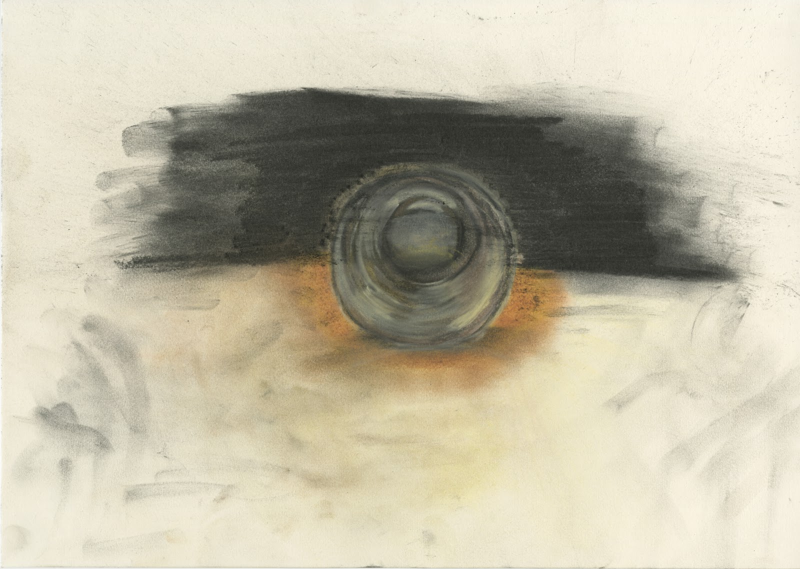
Drawing (C) was done using pastels, (except for the black background used to cover the wall that is done with charcoal), brown, yellow, and green were used to simulate the surface, and for the glass I used  a hint of light blue, black and white. After looking it for many hours  I feel that the perspective is wrong or inaccurately presented, half of the times it reminds me of an orb rather than a glass. I think I have failed with this one and truth be told I don’t have much experience with coloured drawings, so I’ll do my best to explore that area in the future.  
(C) 

Week 6 Directed Study

Excurion to Bradford Cathedral
         This drawing is a 35 minute sketch of the interior of the Bradford Cathedral. The main focus of this drawing are composition, lighting and proportions.
         In terms of its composition the two pillars on the left and right side act as a frame in which the rest of the drawing is focused. The stairs provide  a diagonal line that guides the eye to the window on the top, that breaks the monotony of the image.
          Lighting is an issue, stronger shadows should be drawn especially on the pillars to give the impression of depth.  


Week 5 directed Study


Sky Shapes
1 Sunset
 This soft pastel drawing took me roughly about 25 minutes to comlpete. The main focus here is to give the impression of a sunset. Colour used were yellow, orange, red, and purple smudged together in layers, black was only mainly used on the horizon line..

The way I approached this drawing was by drawing a low horizon line, giving more space to show the sky. Due to time constraints I had to draw quickly, so instead of realism I chose impressionism. By observing the different layers of light on the clouds I started smudging different layers of colour resulting into this image. Then used orange with yellow to create shadows that would look like clouds for the first layer, then some orange mixed with pink and a hint of light brown to create darker shadows for the second layer. Finally pink orange, brown and black were used for the third and fourth layers, that way I created an impression of a sunset. 

2 Night Sky
Night sky was drawn with charcoal (except from the white bits that were done with a white pastel) and took me about 25 minutes to complete. In terms of its composition I used the rule of thirds to place the moon on the top right of the drawing, providing a focal point. This allows the viewer to witness the clouds around the moon, or after navigating to the right move their eyes to the house on the bottom right of the image.
Another area I focused on was the landscape, by smudging the charcoal I aimed to give the impression of depth. As I focused more on the foreground I created darker tones, with the small exception of highlights (white pastel) used to replicate the light of the moon bouncing off the rooftops.


Week 4 Directed study


Handling complex information.
Drawing impressionistic scenes is a way of gathering huge amount of information in the least possible time. This week we were on the roof on the Chesham building at the university drawing distant buildings using a variety of different mediums.
These are  15-20 minute sketches where the main focus was to get as much information as I could in the least possible time. The way I approached these sketches was first blur my vision and then draw the core elements of the landscape first (certain big buildings, churches), elements that first catch your eye when looking at landscapes with complex information. Then break them down in terms of scale, composition and perspective. For drawing 1a one of the main features I drew first were the Church that was positioned according to the rule of thirds, then the factory on the right and the row of houses on the bottom left. I also wanted to create a chiaroscuro effect with confident strong dark tones of black and no smudging at all. 
1a
The same approaches apply to drawing 1b but in this case I used smudging to give the impression of depth.
1b
1c 

1c was also drawn using the same methods but was done with graphic markers. By using the different tonal variations of the greyscale markers a more successful impression of depth was achieved.

Week 3 Directed study


Here I have two drawings of the same place (interior of Richmond building) done with two different mediums.
The mediums chosen are  2B pencil and graphic markers. I found out that drawing with markers is much easier to create an impressionist scene than doing it with a pencil, you get better results in less time and because of the impressionistic style, detail is not needed to be accurately represented. Graphic markers have a wider tonal variation (compared to the pencil I used) and in that way I have a higher contrast value in my drawing,  the reason I chose a hard pencil was because I wanted a low contrast drawing because of the hardness of the pencil it’s hard to achieve darker tones.
The way I approached these drawing were on terms of their composition and mediums used.
I used the rule of thirds to place the table and chairs on the bottom left side of the (imaginative) grid, as a focal point to draw the viewers attention. On the opposite top side of that grid there is a corridor that gives the impression of depth allowing the viewer to change between focal points and wandering off into opposite sides of the drawings. 


Week 2 Directed Study


The following drawings are from the dome on top of the Old Building (next to Bradford College) as seen from my flat window.
I  used a 2B pencil to draw most parts to capture as much detail as I could, in certain occasions I had to breakdown the image into smaller parts just to see how the geometry is portrayed. 

Having to work with a pencil make my work much more challenging in putting  all those details, in comparison working with a strong pencil enabled me to draw lightly and spot mistakes that can easily be erased, I find that method more time consuming with better results.

 
Slowly sizing up the same scene makes larger images easier to make because you have already worked on areas of detail, you know how they behave, their position, how they are shaded and in that way I found out that I could add more detail in my final drawing.